Overview
The table component is usually used to render a list of data in a tabular format with the help of rows and columns.
Example: Using the Table component to render a list of Users
Here's how you can render a list of users in the table component.
Creating Columns
To create columns in the Users table, you can add:
- Static Columns: Add each column individually using the
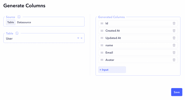
+ Columnbutton in the Column section. You can add columns like name, age, email, and so on with appropriate types like Text, Date Time, Image and so on. - Generate columns from data: Generate columns from a data table by linking a Canonic DB table. This automatically generates columns based on the data table structure. For this example, we will generate columns from the User table created under Datasources which has fields like name, email, age, avatar, etc.
Adding Call to Action (CTA) Buttons
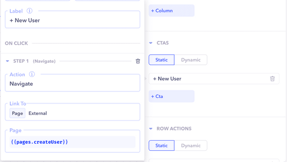
In this example we will add a CTA to add a new user which navigates to the Create User page.
- Add static buttons by clicking on
+ Ctaunder the CTAS section. Set the Label of the CTA as+ New Userand add a step on the onClick handler to navigate to the Create User page.
Row Action Buttons
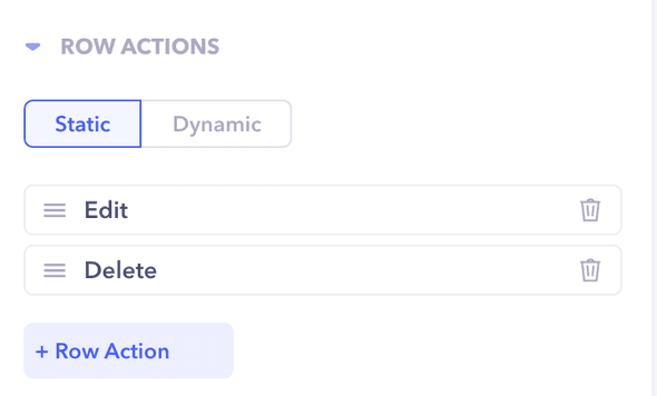
- Add row action buttons by clicking on
+ Row Actionunder the Row Actions tab. In this example we can add two row action buttons: Edit and Delete. - For the Edit button, in the onClick handler, add a step to navigate to the Edit User page.
- For the Delete button, in the onClick handler, add a step to call the Delete user workflow.
Configuring Table Header
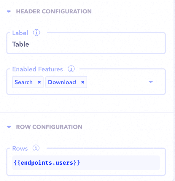
Configure the label of the table and other features like Search, Download, and Refresh from the Header configuration section in the Table properties panel. For this example, we will change the label to Users and add Search and Download from the Enabled Features dropdown.
Row Configuration
Under Row Configuration, we will define the data which is going to be used to render the rows of the table:
- Fetch data from a workflow endpoint, such as Get all Users, which returns an array of Users. This will automatically fill the table with row data.
Table Component Handlers
The table component provides the following handlers:
- onRowClick and onRowDoubleClick: Triggered from the click event of a row in the table. These events can come in handy to set variables on click of a row, execute a workflow or control a component.
- onRefresh: This is triggered by clicking on the Refresh button under the Header section.


