Overview
Tables play a crucial role in displaying and managing data in a structured format. Whether you're dealing with user lists, product inventories, or any other dataset, the table component provides a powerful solution.
Introduction to Tables
The table component is designed to render data in a tabular format, providing features such as searching, filtering, pagination, and more. It can be configured to generate columns automatically based on a specified datasource, or columns can be manually configured.
Key Features :
- Dynamic column generation from a datasource.
- Customizable column types (Text, Rich Text, Date, Time, Image, File, Picker).
- Interactive row actions (e.g., Edit and Delete).
- Triggers for row click and double click events.
- Extensive theming options for customization.
Step 1: Adding the Table Component
Drag and Drop:
Begin by dragging and dropping the table component onto your canvas.
Configure Label:
Set the label for your table, representing the type of data it will display (e.g., "Users").
Step 2: Configuring Datasource
Datasource:
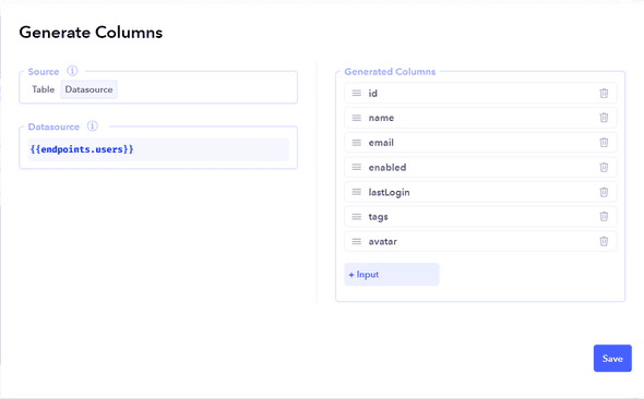
Specify the datasource for the table. This can be an array or list containing the items to be displayed. Automatic Column Generation:
If a datasource is provided, the table will attempt to automatically generate columns based on the structure of the data. Verify that the generated columns match your requirements.
If no datasource is specified, columns must be manually configured.
Step 3: Configuring Columns
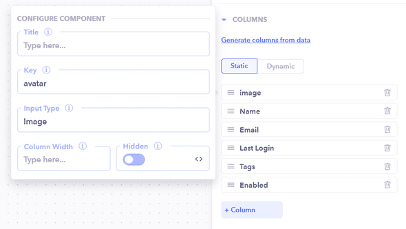
Creating Columns:
Under the table configuration, click + Column to create a new column.
Configure properties like Label, Key, and Type for each column.

Column Types:
Choose appropriate types for your columns (Text, Rich Text, Date, Time, Image, File, Picker).
Step 4: Adding Call to Action (CTA) Buttons
Static Buttons:
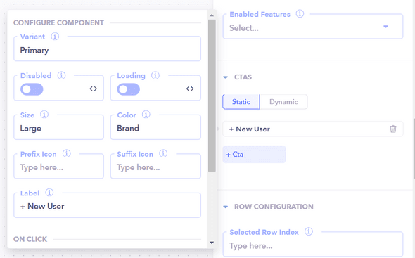
Enhance user interaction by adding static buttons under the CTAs section.
Example: Add a button labeled "+ New User" with an onClick handler to navigate to the Create User page.

Step 5: Adding Row Action Buttons
Row Action Buttons:
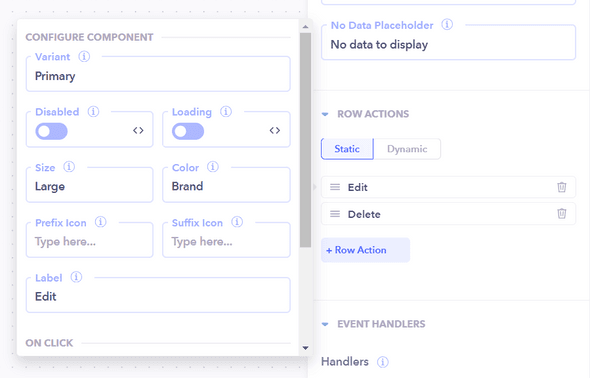
Improve user experience by adding row action buttons under the Row Actions tab.
Example: Add "Edit" and "Delete" buttons with corresponding onClick handlers.

Step 6: Configuring Table Header
Header Configuration:
Customize the table header, including the label, search functionality, and additional features. Example: Change the label to "Users" and enable features like Search and Download.
Step 7: Row Configuration
Fetch Data:
Define how the rows of the table will be populated by fetching data from a workflow endpoint. Example: Use a workflow endpoint such as "Get all Users" to retrieve an array of Users and fill the table with row data.
Step 8: Table Component Handlers
Utilize Handlers:
Leverage the provided handlers for specific actions. Example: Use onRowClick and onRowDoubleClick to trigger events based on clicking a row, and use onRefresh for actions triggered by refreshing the table.
Step 9: Theme Customization
Theme Options:
Customize the appearance of your table using theme options. Adjust properties like title alignment, color, style, text size, padding, shadow, border, and background colors.
