Introduction
Components are building blocks that help interact with, or visualize your data. We support dozens of components that can be configured through Canonic.
Creating a component
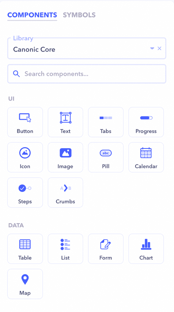
You can create a component by dragging a component from the picker on the right to the desired position on the canvas.
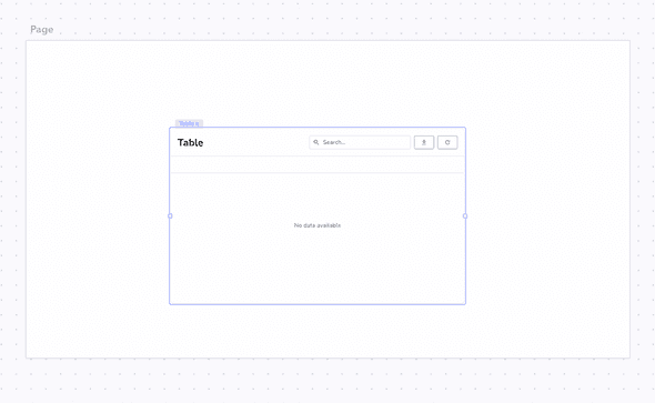
If you want to place it inside another component, you can drop it over the corresponding component. (A blue outline should appear around the component)
Component Anatomy
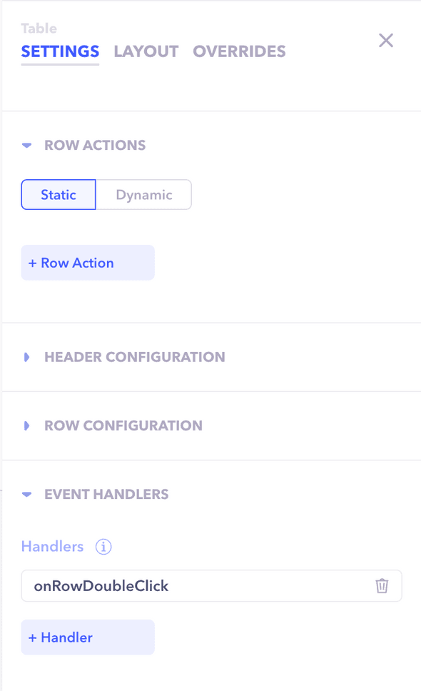
Every component more or less has the same anatomy. You can configure almost everything about a component. How it looks, what datasource to power it with, and how it behaves on certain events such as click.
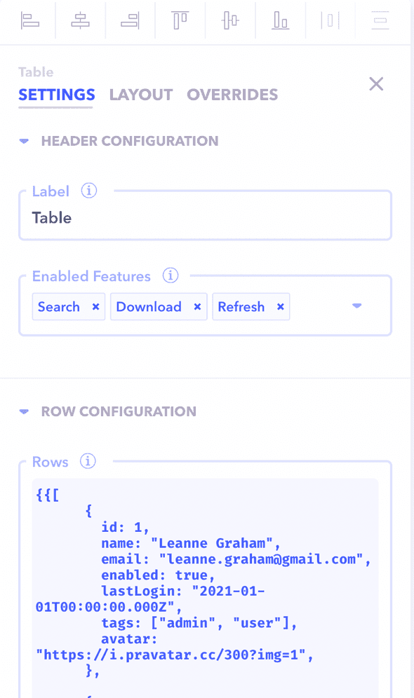
All of this can be configured from the properties panel
-
Input configuration
Each component has a different set of inputs depending on it's type. Tables accepts a list of items to display, the text component accepts the text to display and so on.
You can read more about component configuration here
-
Layout & theming
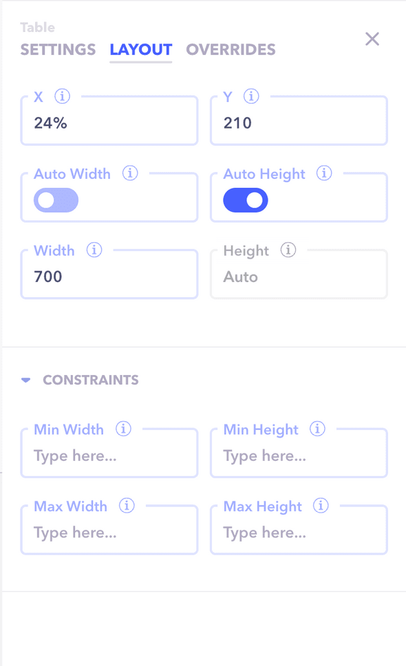
The component's basic positioning and layout is completely customizable. You can change how a component looks, where it should be placed and what it's dimensions are.
You can read more about customising the layout of a component here
-
Action triggers
Sometimes you want to carry out actions based on events such as click or change. These triggers can be added to each component and vary by type.
For example you might trigger a modal on double click of a row
You can read more about action triggers here
